Brand guide
This guide shows how Save a Child’s Heart looks and speaks, so every page, post and video feels like one organization.
Who we are
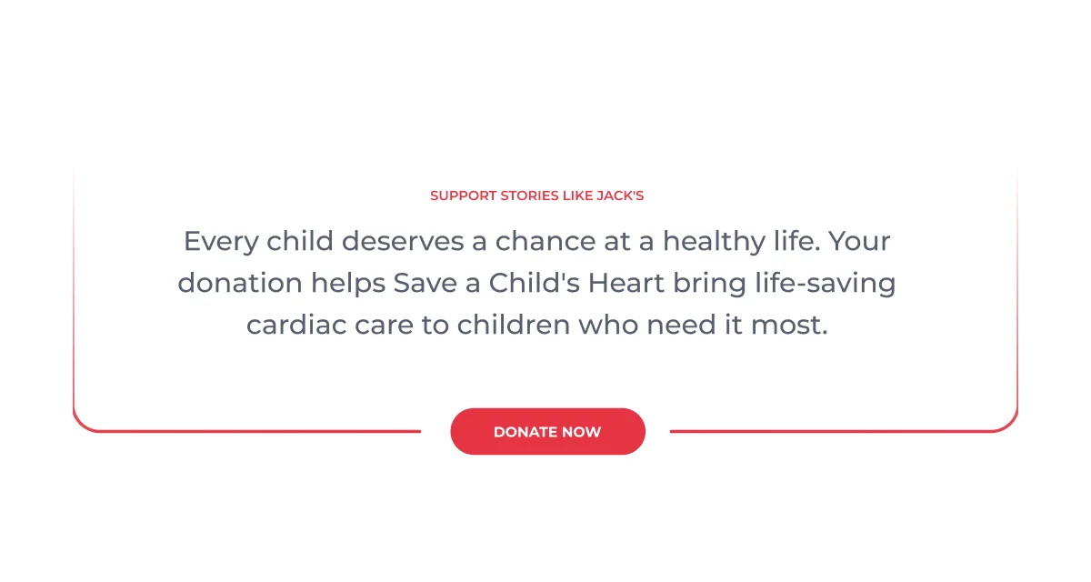
Treating children with congenital or rheumatic heart disease regardless of race, religion, gender, nationality or financial status.
Our brand should feel the same way: open, warm, urgent and human.
Our logo
Our logo brings together a hand, a child and a heart. It is the most recognizable part of our identity, so we use it the same way everywhere and give it room to breathe.

Logo versions
Use the full-color logo whenever you can. Pick the version that keeps the logo clear on its background.
Primary
Full color on white. The default for web, print and documents.
On light backgrounds
Full color on Light Gray panels and page sections.

Mark
The hand on its own, for social avatars, favicons and small spaces where the name is already shown.

Reversed
White on Navy, or on dark and simple photo areas.
Clear space & size
Give the logo room so it reads clearly and never competes with other elements.
Clear space
Keep a margin of x on every side, where x is half the height of the mark.
Minimum size
Full logo: 140 px wide on screen, 35 mm in print. Mark on its own: 24 px high.
Our colors
Our colors are chosen to prompt urgency, empathy and trust. Navy leads headings and structure, Red highlights actions, and clean neutrals keep every layout calm and accessible.
Primary colors
Navy and Red carry the brand. White gives every story room to breathe.
#214884
Headings, titles and navigation.
#E63745
Calls to action. Use sparingly.
#FFFFFF
Backgrounds and cards.
Neutrals & blues
Quiet tones for text, structure and backgrounds, and blues for links, charts and soft panels.
#0E192A
#4B5164
#E4E2DE
#F5F4F2
#3A77D2
#8BA7D2
#C8DCFB
#E3ECF9
Using color
Keep layouts mostly light, let Navy carry the structure, and save Red for the moments that ask someone to act.
Navy leads
Navy carries structure and headings. Red is reserved for high-priority actions like Donate and Get Involved.
Keep contrast high
On White or Light Background, set text in Secondary Gray or Navy. On Navy or Dark Navy, use White.
Red means action
Use Red for buttons, highlights and icons, not for body text or large page backgrounds.
Accessible pairings
Contrast ratios measured with the WCAG formula. AA needs 4.5 : 1 for normal text and 3 : 1 for large text.
Typography
Montserrat is our one typeface: clean, modern, welcoming and professional. The examples below follow the website style guide, so the guide and the site always match.
Our typeface
One family, three weights, each with a clear job. Montserrat is free on Google Fonts, so every team and partner can use it.
Medium 500
Body copy and most text
SemiBold 600
Headings and statistics
Bold 700
Buttons and small labels
Type in use
A few examples of how the type works on the website. Headings and numbers in SemiBold, text in Medium.
Treating children with congenital or rheumatic heart disease regardless of race, religion, gender, nationality or financial status.
Save a Child’s Heart is an international non-profit organization that provides life-saving cardiac care to children from developing countries.
Using type
A clear order on every page: eyebrow, heading, then body.
Color
Headings in Navy, body copy in Secondary Gray. On Navy or photos, set all type in White.
Hierarchy
One Red eyebrow above a section title, then the heading, then body copy. Keep one H1 per page.
Weights
Medium for text, SemiBold for headings and numbers, Bold for buttons. One typeface: Montserrat.
The Living Frame
SACH’s design system uses an open frame drawn from the EKG line, a symbol of urgency, life, and the heartbeat at the center of everything SACH does. The frame holds the stories of children from around the world, and stays open because the work is never finished.
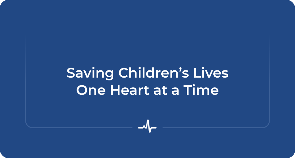
Four ideas behind the frame
Every use of the frame should carry these four ideas.
Open
The work is unfinished, there are still children waiting.
Continuous
The line never stops, just as the mission never stops.
Urgent
Drawn from the EKG, the language of life and time.
Human
It frames stories, not data.
Core icons
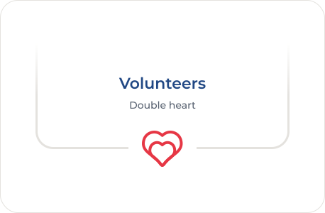
Four icons carry meaning. Each one names what the section is about, and each one lives in the bracket.
Bracket anatomy
The frame is one rounded line, open on one side. An icon in the closed side is optional.
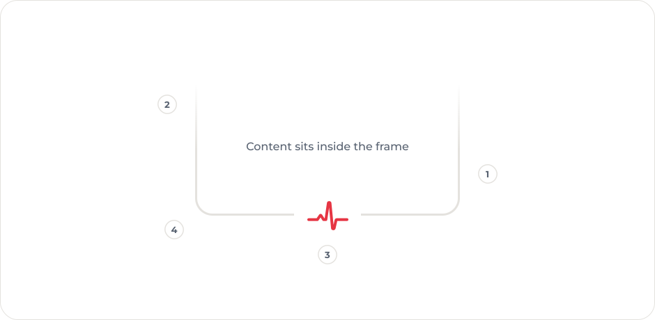
Line
A thin line in Border gray on white. On Navy or photos, use Medium Blue or White.
Open side
The line fades out toward the open side.
Icon (optional)
The bracket can stand on its own, or hold one icon in a break in the closed side. Only the four core icons go in the bracket.
Corners
Rounded closed corners, matching our images and cards.
Directions
Open the frame toward where the eye should go next. Open at the top is the default.
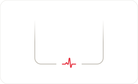
Open top
The default. The section closes on the icon below.
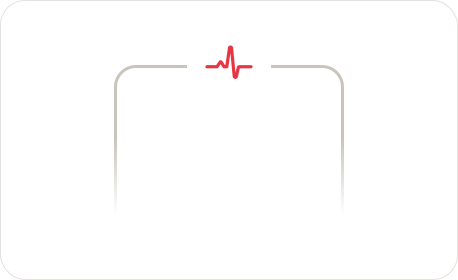
Open bottom
Opens downward into the next section.
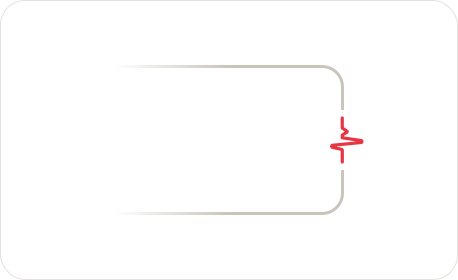
Open left
For side brackets and cards that read from the left.
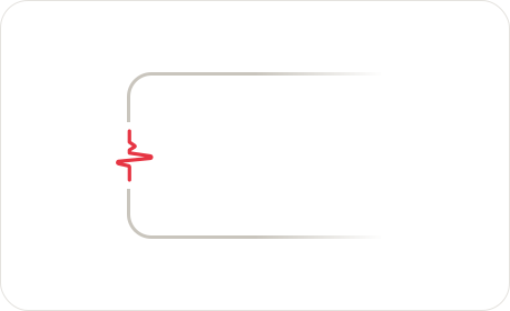
Open right
For side brackets that lead the eye to the right.
Bracket in use
The same frame carries across the website, social media and motion. Keep the line, the fade and one icon; change only the line color to suit the background.
Website
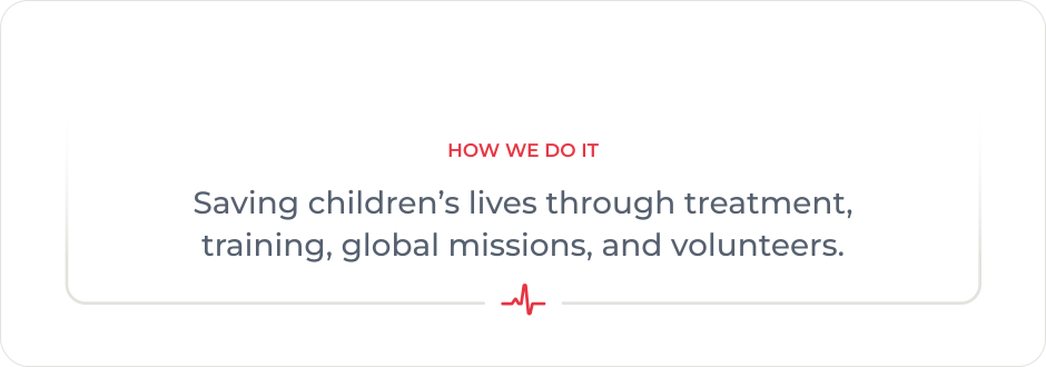
Section headers use the Ekg Bracket component, open at the top, with the icon in the bottom line.
Variations
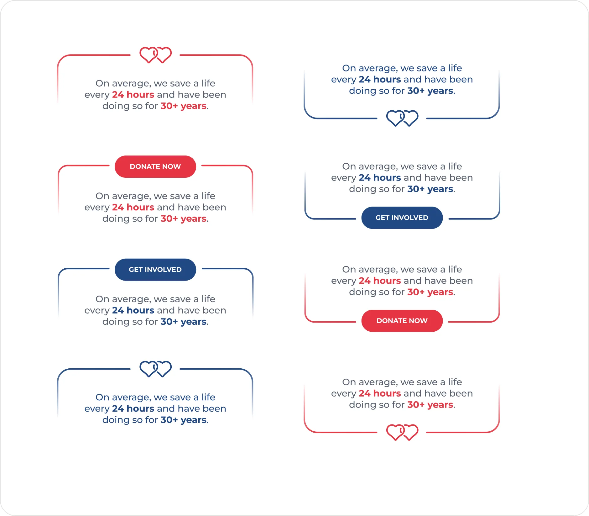
The icon or a button can sit in the line, at the top or at the bottom. Use a Red line with Red buttons and a Navy line with Navy buttons.
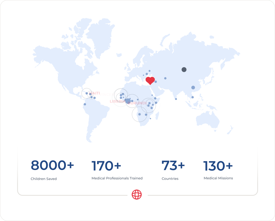
Statistics with the map
A wide statistics panel closes on the globe, with the map above it.
Secondary icons
Supporting icons for specific use cases: contact details, downloads, events, giving. They never sit in the bracket. Same rounded line, in Navy on light backgrounds.


Motion
Motion brings the Living Frame to life: the frame opens, the story builds and the numbers count up.
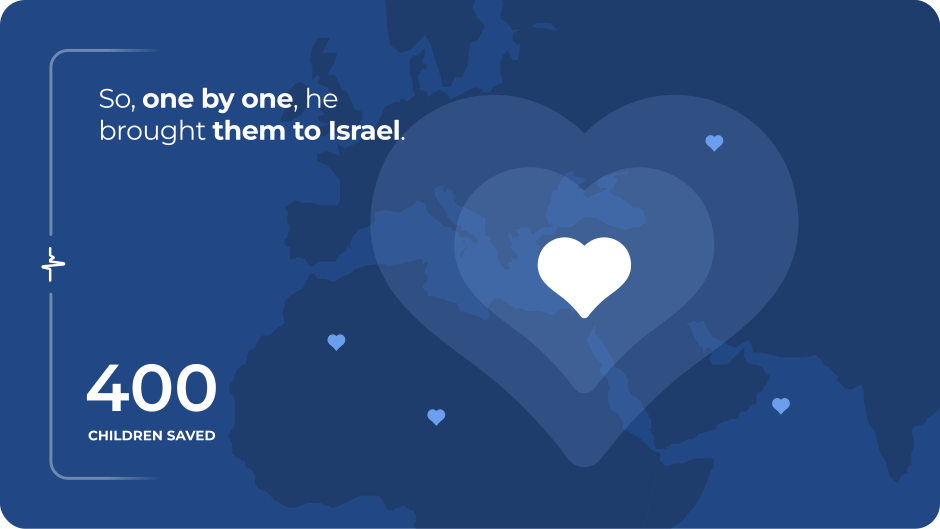
The motion graphic
The full story in eight scenes, from one doctor to hundreds.
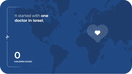
It started with one doctor in Israel,
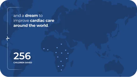
and a dream to improve cardiac care around the world.
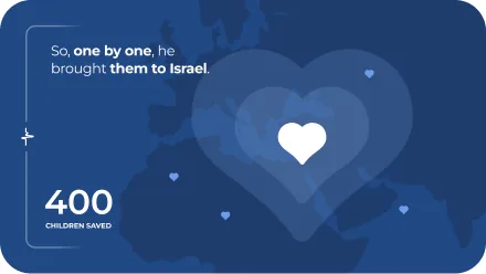
So, one by one, he brought them to Israel.
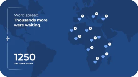
Word spread. Thousands more were waiting.
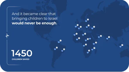
And it became clear that bringing children to Israel would never be enough.
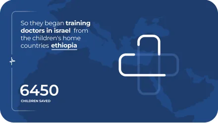
So they began training doctors in israel from the children's home countries
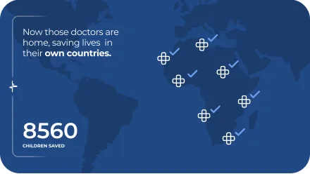
Now those doctors are home, saving lives in their own countries.
It started with one doctor. It continues with hundreds.
Principles
How the brand moves.
The frame opens
The bracket draws on, then holds still so the story has a place to sit.
Numbers count up
Statistics count up to the real figure, then stop.
Gentle pulse
The EKG and the hearts pulse softly as accents. Keep movement calm.
Website
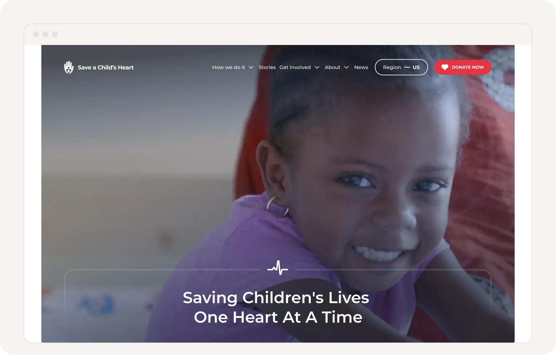
The website is where the brand comes together: Navy structure, white space, real photos and the Living Frame.
Building blocks
The website is built from a small set of components. Reuse them before designing anything new.
Section headers
Each section opens with the bracket, an eyebrow and a heading. The icon tells you what the section is about.
Calls to action
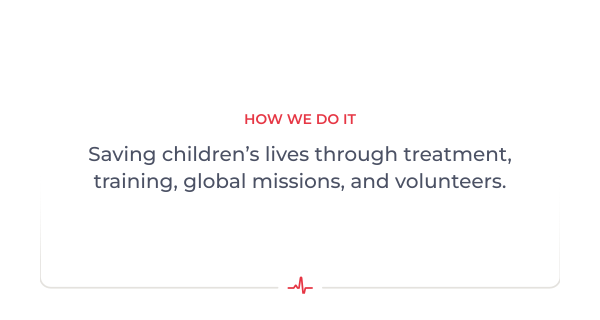
One clear action per section. Red for giving, Navy or outline for everything else.
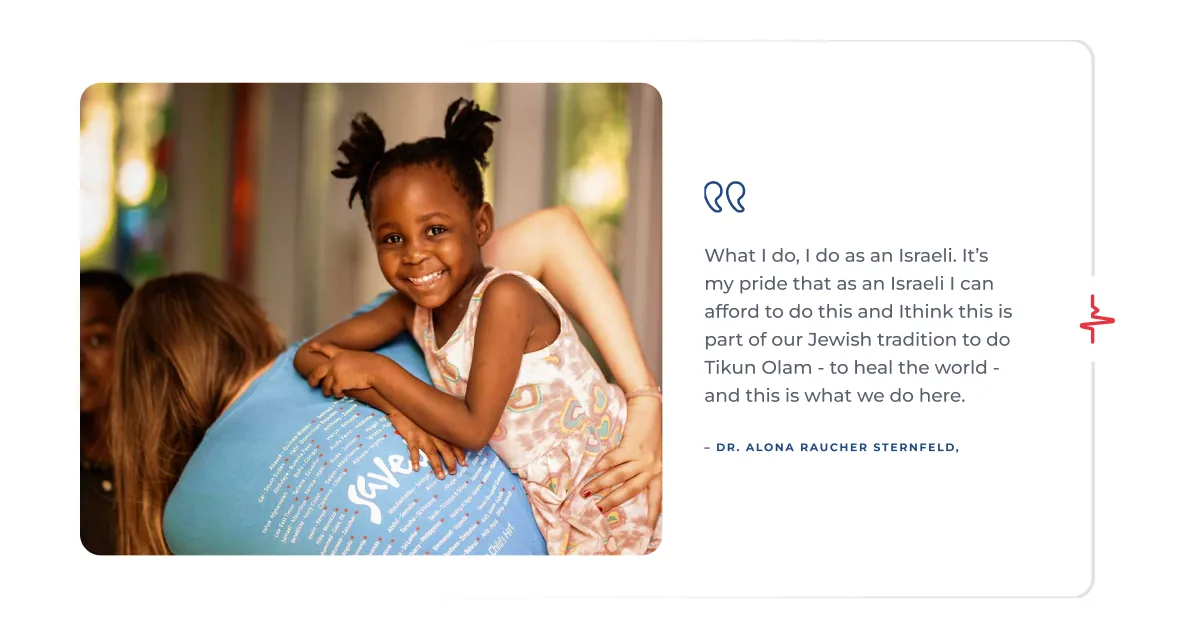
Quotes
Let families, doctors and volunteers speak. Quotes sit beside a photo, with the quote icon in the bracket.
Page rhythm
A few habits keep every page calm and easy to scan.
Breathe
Generous white space between sections. Alternate White and Light Background panels.
One bracket at a time
Use the bracket to frame the key message of a section, not every block.
One red action
Keep Red for the main action on screen, usually Donate.
Photography
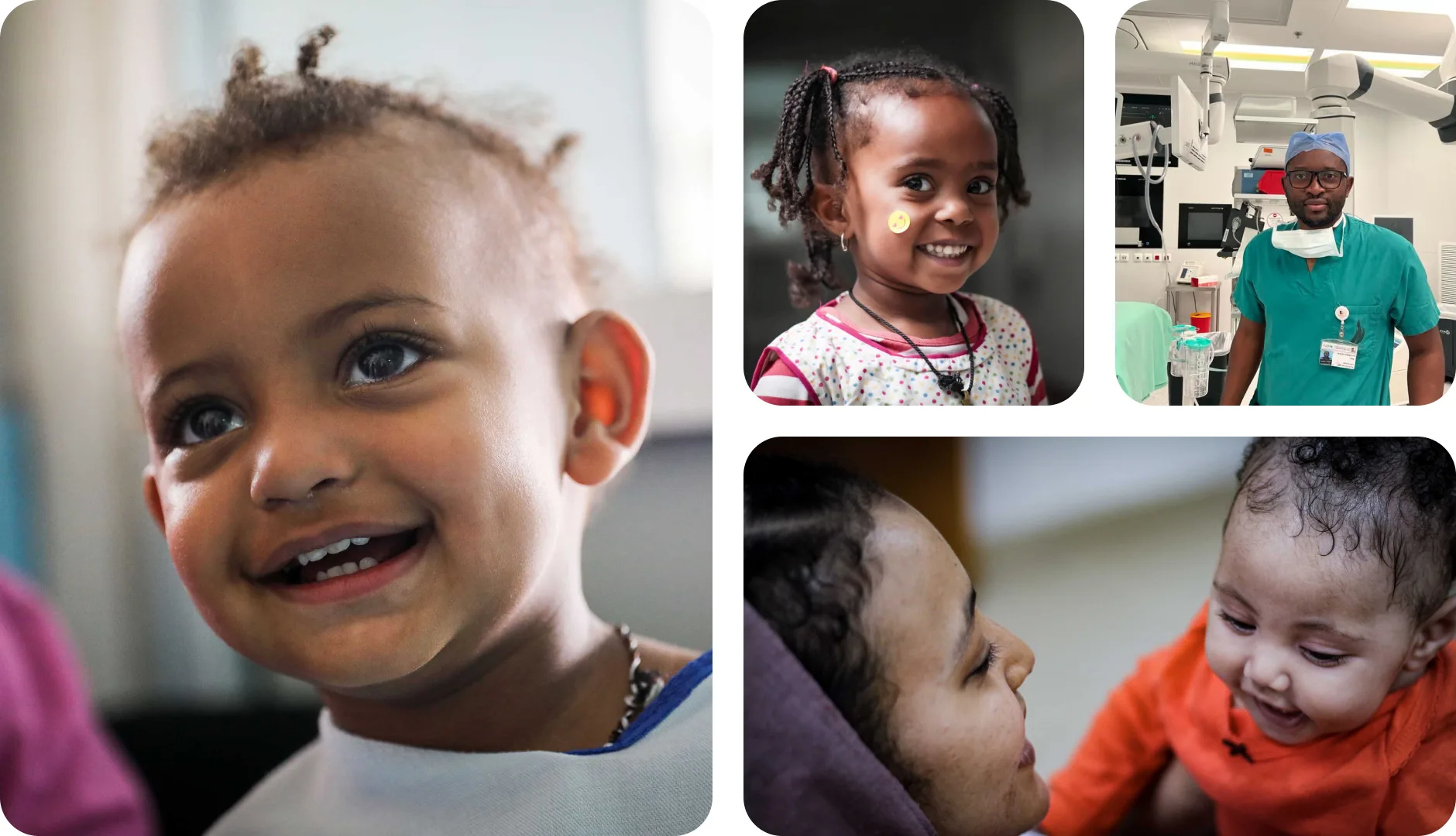
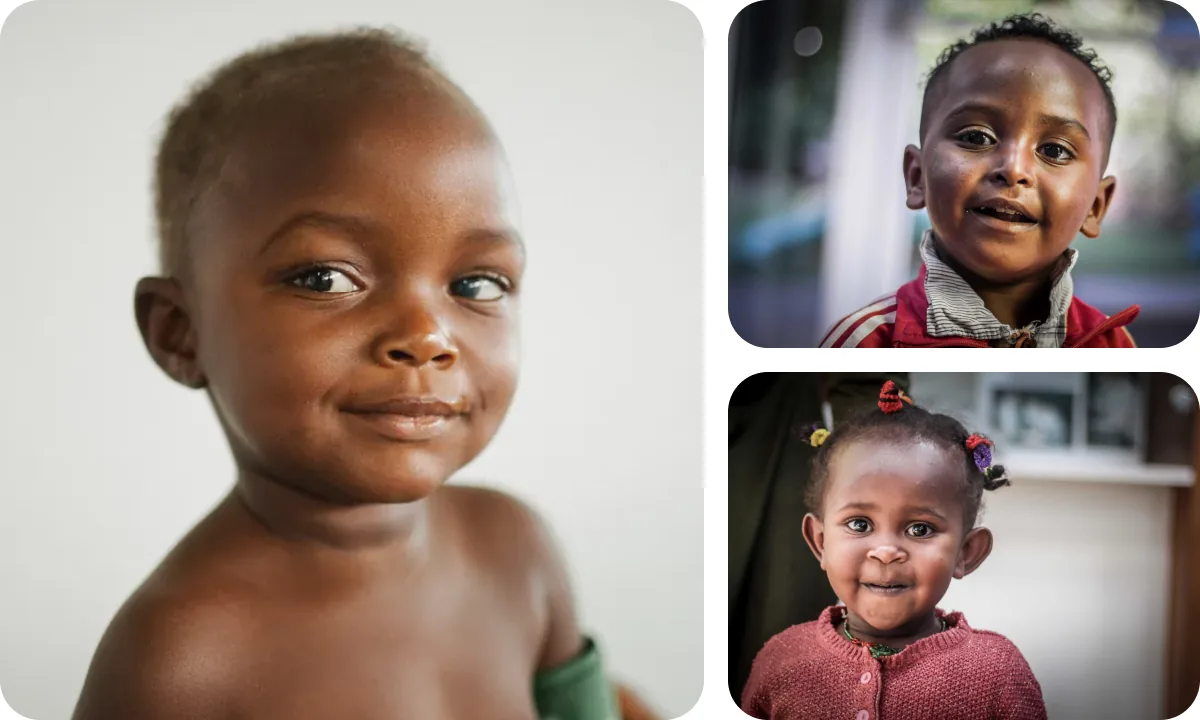
Our photos show real children, families and medical teams. They are warm, close and honest: the child is the hero, and hope is always in the frame.
Direction
Four ideas guide every photo we choose or commission.
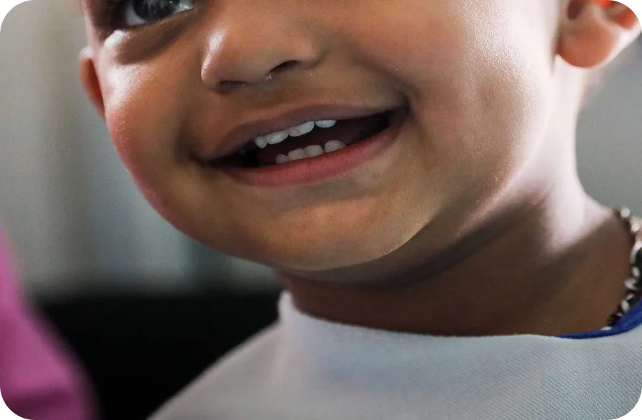
Children first
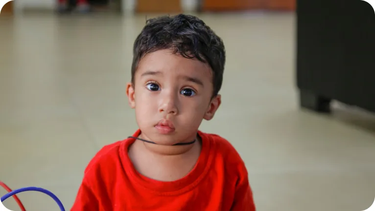
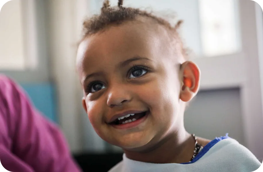
Every story starts with a child. Get close, at eye level, and let their expression lead.
Care in action
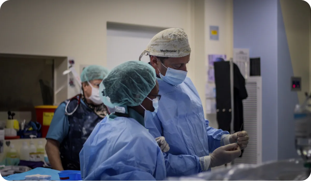
Show the medical team at work: surgeons, nurses and trainees, focused and caring. Hands, eyes and teamwork say more than equipment.
Family and community
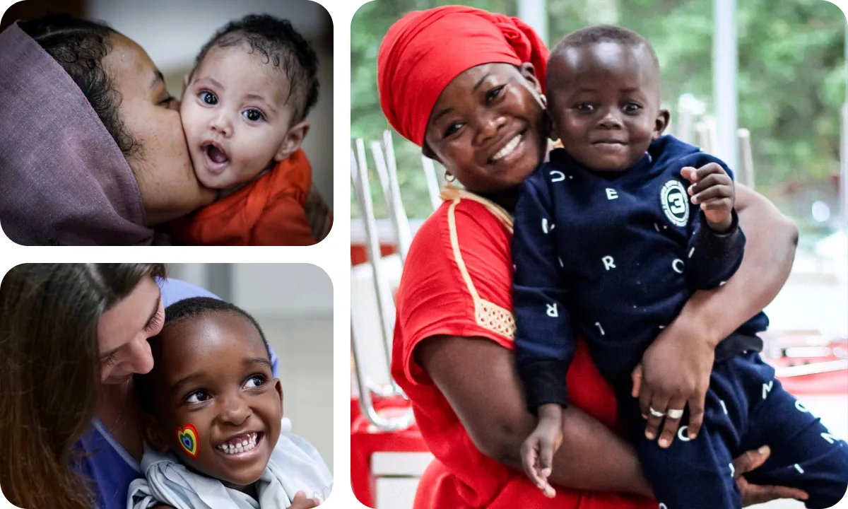
Mothers, volunteers and visitors around the child show the support behind every recovery.
Hope, not pity
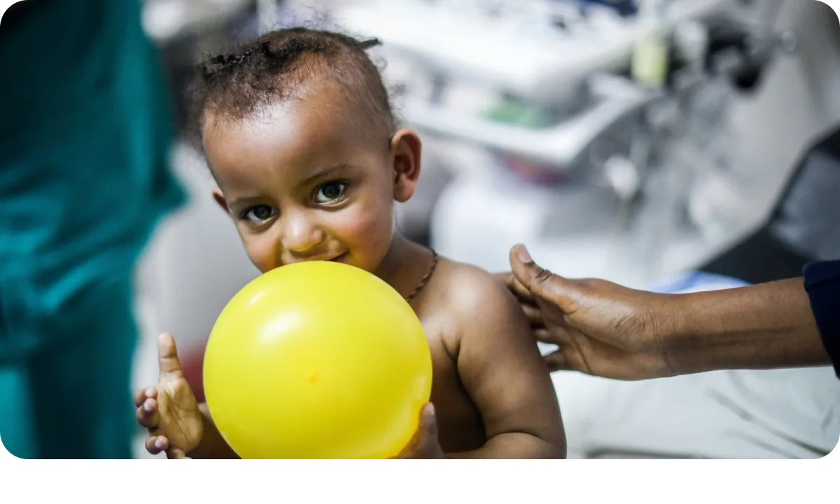
Choose moments of recovery, play and connection. Avoid images that show pain or distress for effect.
Cropping
Crop for the place the photo will live, and keep the face and the moment in view.
Website heroes and video
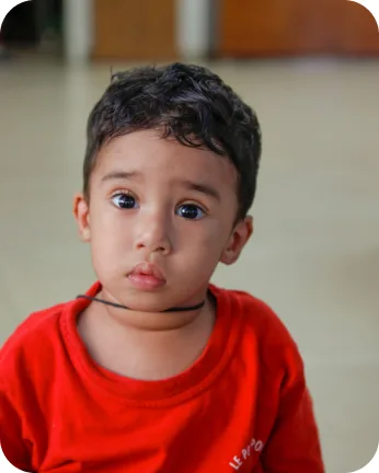
Feed posts
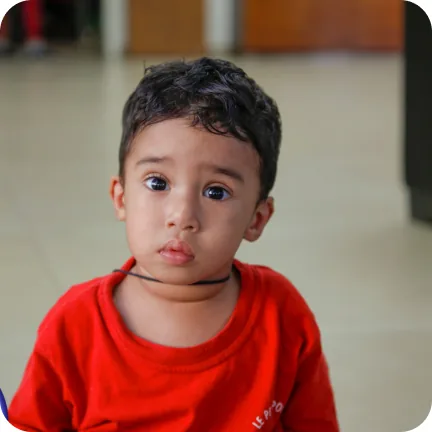
Posts and avatars
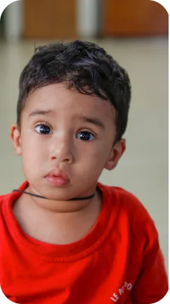
Stories and Reels

Keep the eyes in the upper third, with room around the face.

Crop through the head or the face.
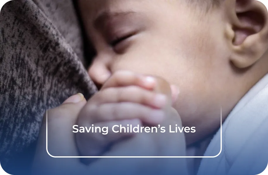
Leave a calm area for the bracket and the text.
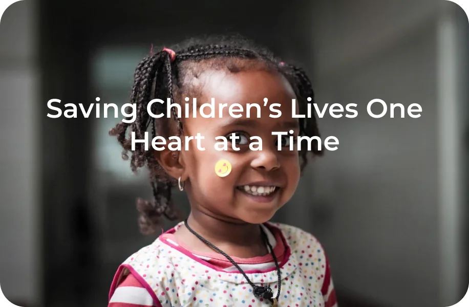
Put text or graphics over a face.
Video
Video follows the same direction as our photos: real people, real moments, and the brand at the close.
Real moments
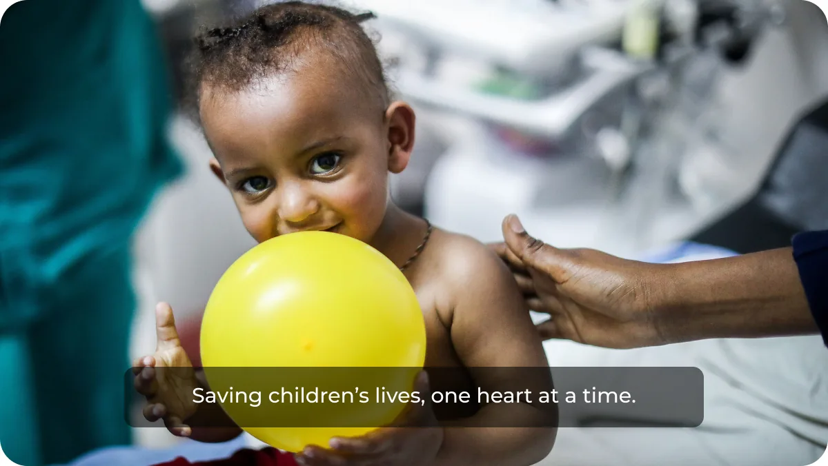
Film the work as it happens. Let scenes breathe, keep the camera steady, and stay close to the child and the team.
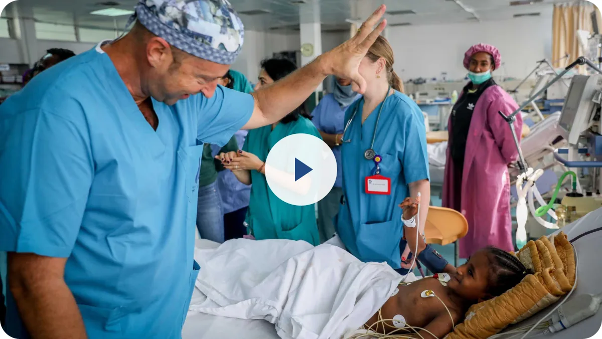
Captions on
Always add captions so the story works with the sound off. Set them in Montserrat, white on a soft dark band.
Close on the brand
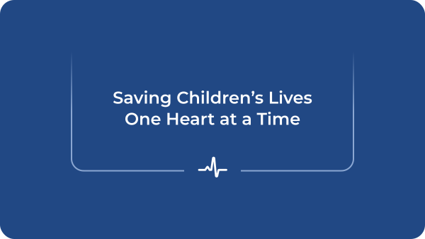
End every video on a Navy card with the bracket, one core icon and the headline, then the logo.
Best practices
Three checks before any photo or video goes out.
Real, not staged
Use photos of SACH children, families and teams. No stock imagery of patients or doctors.
Consent first
Only use images the family or person has agreed to share, and follow SACH’s privacy rules for children.
Natural light and color
Keep color true and light natural. No heavy filters, no added effects.
AI usage
Save a Child’s Heart is a real organization caring for real children. Authentic images and humanity come first, so AI is a tool that assists the work. It never replaces real people or real moments.
Photography
AI can assist with real photos. The people in them always stay recognizable and true to life.
Use AI to
Never use AI to
Writing
AI can help draft and polish. Detailed writing guidelines are being developed with our content writer.
Use AI to
Never use AI to
Website and development
AI is a useful tool for building and running the website. A person still checks everything before it goes live.
Use AI to
Never use AI to
Review checklist
Before anything made with AI goes out, check three things.
Facts
Every number, name and date matches a SACH source.
People
Quotes and images of people are real, approved and recognizable.
Privacy
Consent is in place and no private details are shared.
Social media
Every post, Story and Reel uses the same parts: a real photo, the bracket and a Navy panel. Landscape works for video and the website; portrait for feeds, Stories and Reels (9:16, 1080 × 1920 px).
16:9 · Video title card and website
9:16 · Story, Navy panel halfway
9:16 · Story, bracket over the photo
Stories & Reels
Mission stories in two looks: Navy panels, and a light version with a gray line.